FEATURE Image: February 2018. Village “Art” Theatre, 1548-50 N. Clark Street, Chicago, Illinois 60610. The use of masks had been used in theatre since ancient times. They were usually tied to their dramatic source material and the inherent psychology of the characters. The Landmark Designation Report for the Village Theatre described this polychrome character head with musical instruments as “singing” in honor of the neighboring Germania Club, a German social club with its origins in men’s choral music. The head also wears a Baroque-style “wig” of oak leaves and acorns. In Germany, oak trees are revered, and acorns are a symbol of good luck. A decorative keystone on the theater’s round-arched window also has an acorn ornament. 88% 7.94mb DSC_4799 Author’s photograph.
The Village Art Theatre was more than a neighborhood movie house. It embodied Chicago’s early film culture, immigrant heritage, and evolving urban identity for over a century. Although the building itself was demolished in 2018, the survival of its historic façade highlights both the possibilities and limitations of preserving architectural memory amid redevelopment.
Historical Origins & Opening
Designed by architect Adolphe Woerner (born Stuttgart, Germany 1851- 1926), the Village (Art) Theatre opened as the Germania Theatre on July 29, 1916 and closed in its 91st year in March 2007. The building was erected by German-born Frank Schoeninger exclusively as a movie theater for $75,000 (about $2.2 million in 2025) and leased for an annual $7,000 rent (about $205,000 today) to Herman L. Gumbiner (Germany, 1879- 1952, Santa Monica, Calif.) in a 10-year contract with his company, The Villas Amusement Company (later Gumbiner Theatrical Enterprises).
The Rise of Neighborhood Movie Houses
By 1910, buildings erected solely for the purpose to showcase motion pictures were becoming increasingly popular as the appetite to consume the latest silent motion pictures out of Hollywood was booming everywhere. These neighborhood movie houses, larger than dingy storefront nickelodeons and yet smaller than flamboyantly ornate vaudeville theatres, had movie “palace” touches while fitted conveniently into Chicago’s many local commercial strips.
Scale, Survival, and Target Audience
Nearly all of these first-generation movie theaters in Chicago have been demolished or remodeled for other purposes including those larger-scale theaters developed by major theater operators such as Balaban and Katz, Lubliner and Trinz, and the Marks Brothers. While those palatial theatres could hold between 2,000 and 4,000 movie-goers the Village Theatre, one of the last and best first generation movie houses to survive for so long, originally held 1,000 spectators. Originally named the Germania Theater because it was next door to the Germania Club, it looked to attract affluent club members to its flicks.
The theater reflected the strong German-American presence in the neighborhood through its decorative symbols and association with the neighboring Germania Club.
The Germania Theatre was built in 1916 on Frank Schoeninger’s open land pictured above between the Germania Club (completed in 1889) and his tavern and hotel on the corner of Clark Street and North Avenue. In 1986 the Germania Club, citing the dwindling numbers of members, finally disbanded. Public Domain.
Herman Gumbinger and Expansion to Los Angeles
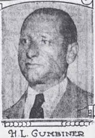
Herman Gumbinger was a major film exhibitor who was busy in Chicago building his independent theatre chain in the 1910’s, with several new movie house projects and acquisitions throughout the city’s northside primarily. After building Chicago’s first independent movie house chain in the teens, Gumbinger relocated to Los Angeles, California, in 1921 where he built the famous Los Angeles Theatre in the Broadway Historic Theatre District of Downtown L.A. Erected at a cost of over $1.5 million ($31 million today) and designed by renowned movie theatre architect S. Charles Lee (1899-1990) Gumbinger’s theatre premiered Charlie Chaplin’s City Lights. Gumbinger Theatrical Enterprises finally dissolved in 1943.
Herman Gumbinger (1879-1956), c. 1924, built Chicago’s first independent movie chain, including what became the Village Art Theatre. By the end of the 1920s, Chicago had more than thirty of these movie palace theaters. Among its holdings, Herman Gubinger and his brothers operated the New Blaine which was renamed and is today the Music Box Theatre. Public Domain.
Neighborhood Context and Architectural Design
The Germania was one of the first-generation movie theatres built at the intersection of three Chicago neighborhoods – Gold Coast to the south and east, Old Town to the north and west and Lincoln Park to the north. An architectural mix of styles including Classical Revival (triangle pediments, pilasters and cornice with dentils fashioned in terra cotta) and Renaissance Revival (rusticated exterior and round-arched windows with keystones), the movie house also incorporated Germanic symbolism in its details reflecting the area’s then prominent ethnic group.
WWI Impact and a Century of Name Changes
During World War One, in a wave of anti-German sentiment, The Germania Club renamed itself the Lincoln Club. It changed its name back in 1921. The Germania Theatre changed its name to the Parkside and never looked back. In 1931 until 1962 it was known as the Gold Coast theatre. Meanwhile, prohibition closed down Frank Schoeninger’s tavern and he left for Wisconsin. In the 1960’s the theatre was updated and renamed the Globe Theatre. In 1967 the building was renamed the Village Theatre after it survived being demolished by the nearby Sandburg Village development.
Sandburg Village is a Chicago urban renewal project consisting of eight high-rise buildings, a mid-rise building and 60 townhomes and artists’ lofts. The development was first occupied In 1963 and completed in 1971. In the early 1960’s the Village Theatre was to be incorporated into the project until its landowner refused to sell. PHOTO: “20190323 08 Carl Sandburg Village (49490506022)” by David Wilson from Oak Park, Illinois, USA is licensed under CC BY 2.0.
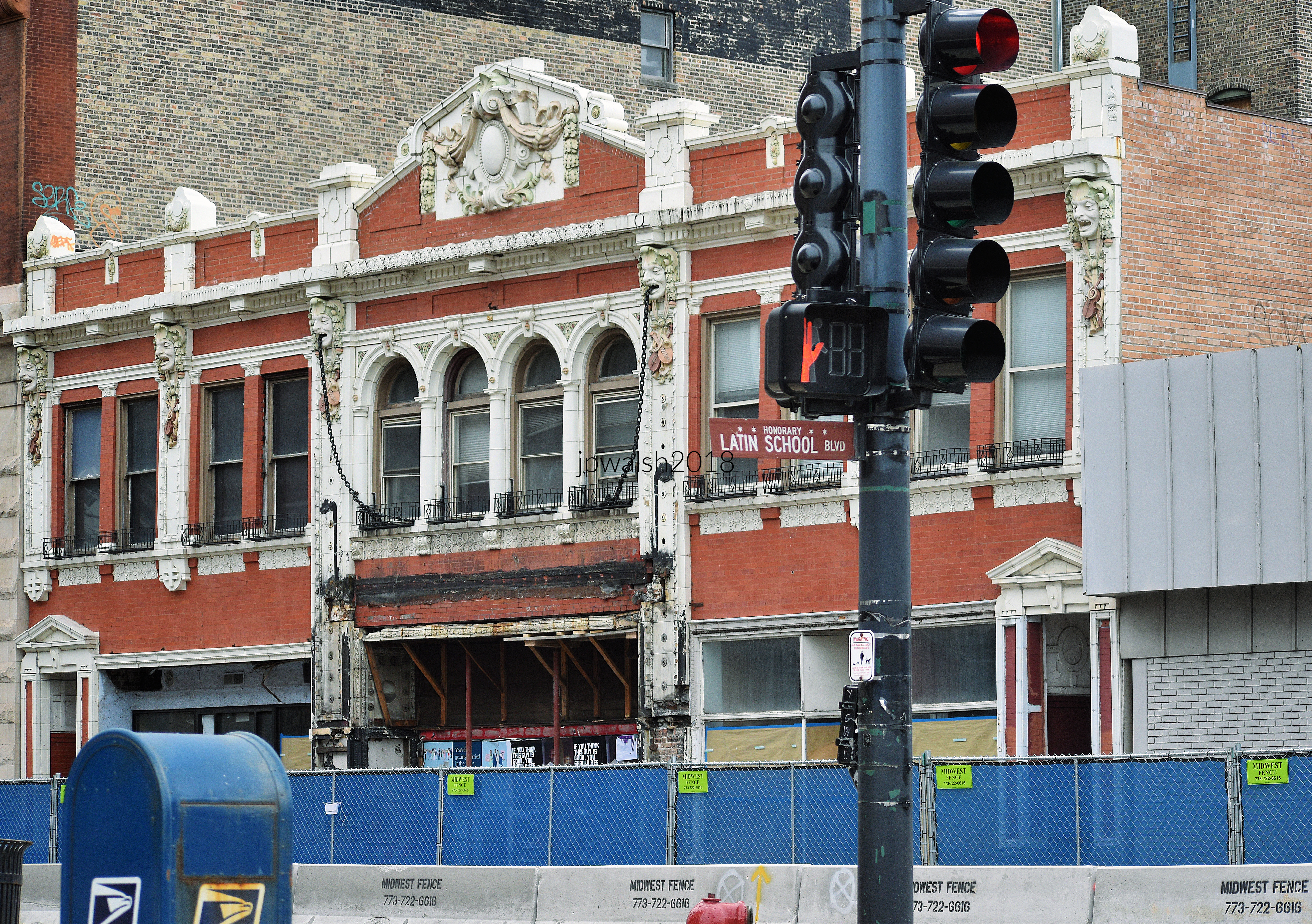
February 2018. The Village Theatre in the last days before its demolition. Its marquee from the 1960’s has been removed. The Village Theatre sat across the street from Latin School of Chicago at North and Clark Streets in Gold Coast/Old Town. In its Landmark Designation Report, the Village Theatre façade is described as having “a symmetrical arrangement, with a central theater entrance and separate entrances to the upstairs offices at opposite ends of the building. Each upper-story entrance has a deeply-recessed alcove lined with brick and white, carved-wood panels. A limestone slab step, inset with hexagonal tiles, is inside each alcove. Each alcove is framed with white terra cotta and brick pilasters on a base of gray terra cotta, made to imitate granite. The pilasters are topped with a triangular, white terra-cotta pediment.” 70% 7.93 mb DSC_4797. Author’s photograph.
Architectural Features and Exterior Appearance
The original two-story façade of red pressed brick and white beige glazed terra cotta decoration competed with a sizeable modern marquee that was removed before its demolition in 2018.
Personal Memories and Moviegoing Experiences
Since after college I was living in Chicago in the 1980s and 1990s, I saw several films at the Village Theatre before it became a multi-plex in 1991 such as House of Games, Fatal Attraction, Wall Street (1987), The Unbearable Lightness of Being (1988), Russia House (1990). In early 1991 the interior of the theater was divided into four screens, and I didn’t stop going to movies there–JFK (1991), Michael Collins (1996), The Red Violin (1999) and more– but not as frequently. Anyway, I moved essentially out of neighborhood in 1995 and sold my condo soon afterwards. The Village Art Theatre in Chicago officially closed as a movie venue in March 2007.
The theater underwent several name changes, including Parkside, Gold Coast, Globe, and finally Village Theatre, adapting to changing audiences and neighborhoods.
Demolition and Modern Condominium Redevelopment
In April 2018, the Village Theatre and neighboring buildings along North Avenue were completely demolished to make way for construction of a condominium building. The ornate Clark Street frontage was stabilized as everything else crumbled to dust around it. The façade was repurposed to serve as the entrance for the new condo development known as Fifteen Fifty on the Park with units priced at opening at $1.625 to $5.85 million.
Beginning in 1969, it became associated with art-house cinema through screenings connected to the Chicago International Film Festival, leading to its “Village Art Theatre” identity. Its run as a core festival venue ended following the October 1989 run.
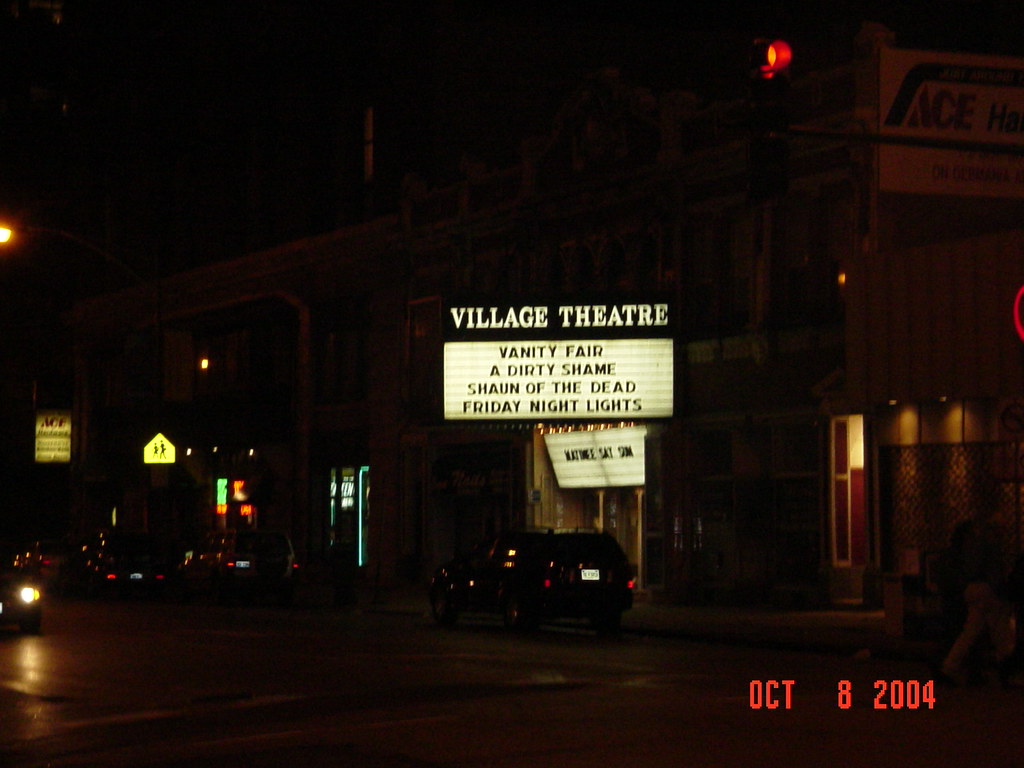
The Village Theatre took the moniker Village Art Theatre after The Chicago International Film Festival used the Village Theatre as a venue to screen “art house” films starting in 1969.In early 1991, the historic 900-seat single auditorium was completely gutted and divided into four smaller screens. This structural partition broke up the grand theater space, ending its era as a primary, large-format host for the main international film festival tracks. October 2004. PHOTO: “Village Art Theatre” by BWChicago is licensed under CC BY-NC 2.0.
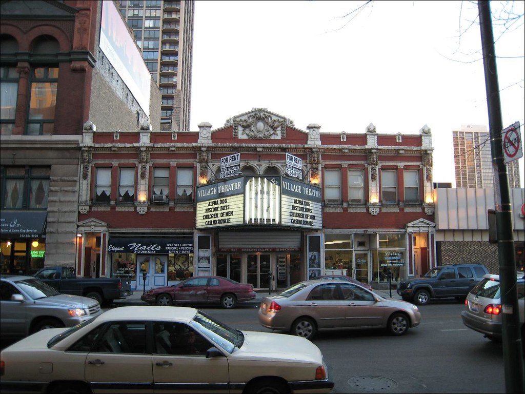
The Village Theatre had at least three distinctive marquees during its history. The first was the original vertical Germania sign, removed almost as soon as it was installed because of anti-German sentiment during World War I. It was followed by a horizontal awning-style marquee, similar to that of Chicago’s Biograph Theater at 2433 N. Lincoln Avenue, installed during the theater’s years as the Gold Coast. The third was the dramatic prow-shaped marquee shown here, paired with steel-and-glass doors and believed to date from the mid-1960s renovations undertaken when the movie house operated as the Globe. PHOTO: “Germania (Parkside, Gold Coast, Globe, Village) Theatre, Chicago, IL” by BWChicago is licensed under CC BY-NC 2.0.
Demolished in 2018 for a luxury condominium development, the building’s ornate façade was retained and incorporated into the new project. October 2018. Author’s collection.
The Village Art Theatre was one of Chicago’s earliest purpose-built neighborhood movie palaces, constructed during the rapid growth of motion-picture exhibition. The building’s history captures its full arc as an architectural, cultural, and neighborhood landmark, ending with the forever tension between preservation and redevelopment.
This explanatory article may be periodically updated.
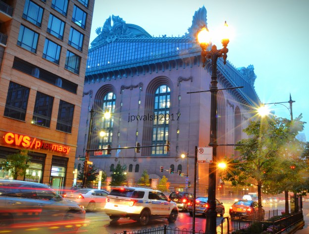
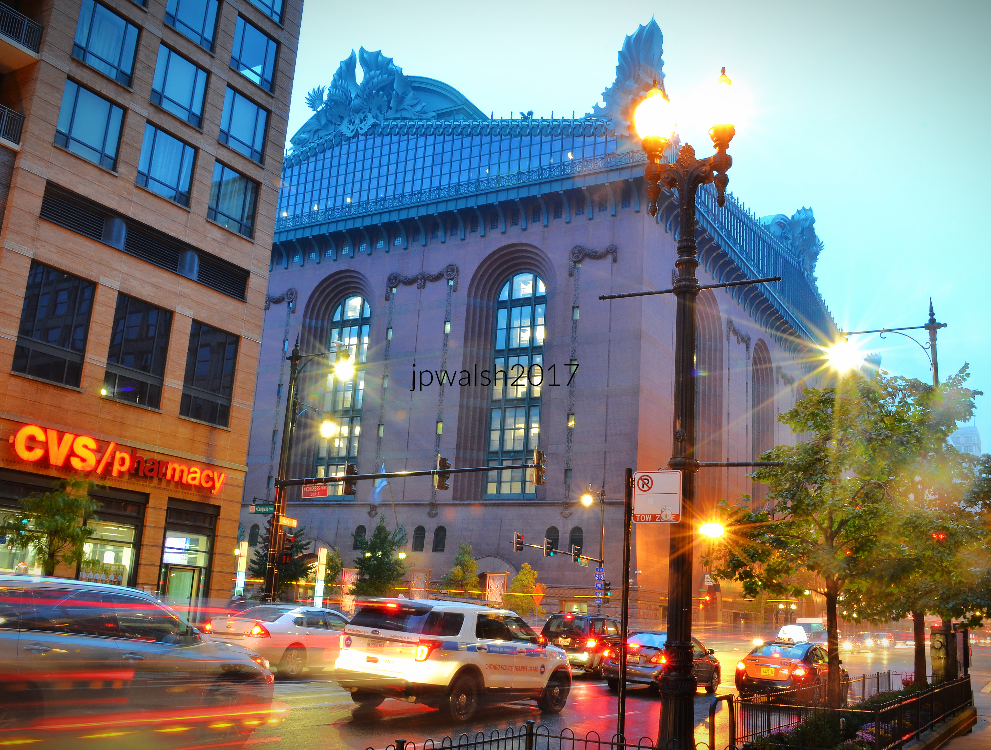
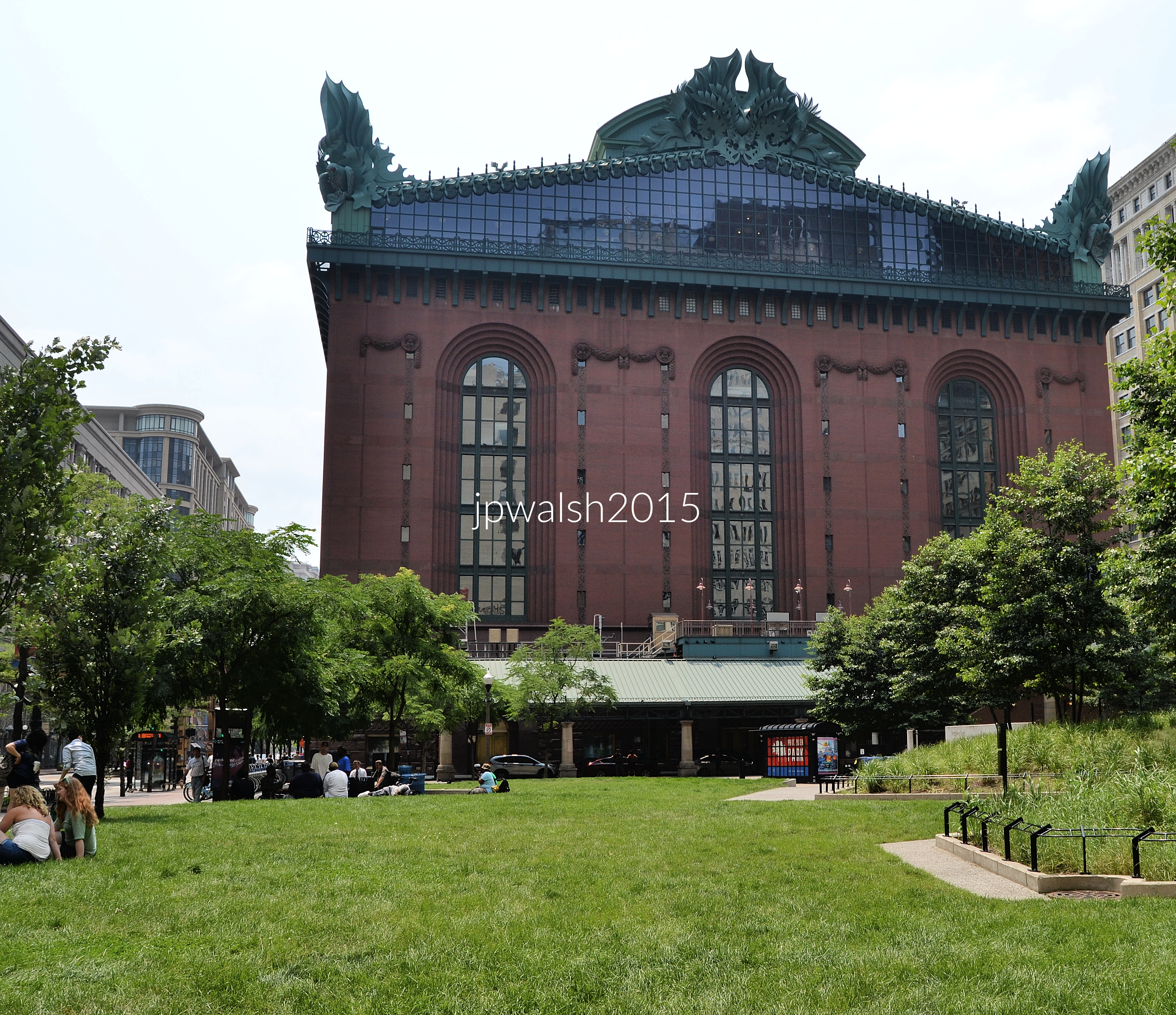
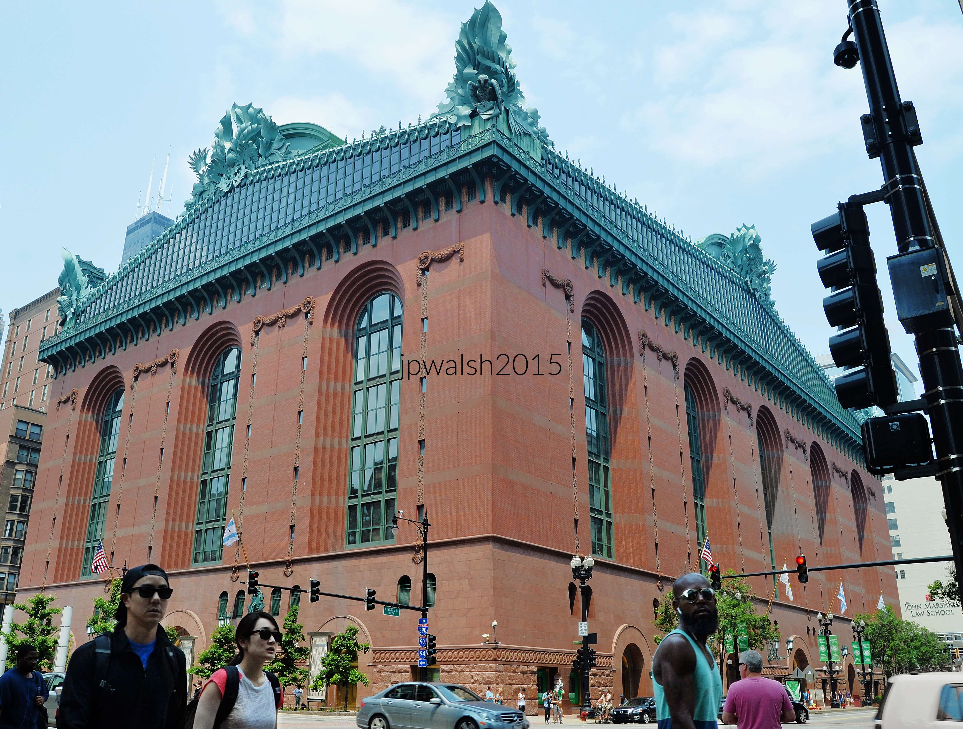
FEATURE image: The Harold Washington Library sits on the northwest corner of State Street and Ida B. Wells (Congress) Drive. It is recognized as one of the largest public library buildings in the world. November 2017. Author’s photograph. 5.02 mb.
The Harold Washington Library Center is a landmark of late 20th-century Chicago architecture that successfully combines the civic grandeur of traditional monumental buildings with a distinctly postmodern design vocabulary, while serving as both a major public institution and a lasting tribute to Mayor Harold Washington.
The decorative pediment of stylized aluminum sculptures was designed by Kent Bloomer in 1993. With enormous owls at each of the pediment’s four corners (“acroteria”), the large sculptures represent growth and wisdom. see – Harold Washington Library Center | Chicago Architecture Center – retrieved February 16, 2026. November 2017.Author’s photograph. 5.02 mb.
Designed by Hammond, Beeby & Babka after winning the 1987 competition for Chicago’s new central library. Completed in 1991 and remains one of the firm’s best-known works.
In 1987, Hammond, Beeby and Babka won the competition to design the main branch of Chicago’s library. The Harold Washington Library was completed in 1991 and is one of the Chicago-based architectural firm’s most famous structures. The building recalls neo-classical institutional buildings yet whose style is creatively applied in its details.
PHOTO: “Harold Washington (9519692588)” by City of Boston Archives from West Roxbury, United States is licensed under CC BY 2.0.
Harold Washington Library Center (1991) is named in honor of Harold Washington, Chicago’s first Black mayor, whose election in April 1983 reshaped the city’s political landscape. Re-elected in 1987, Washington served until his sudden death later that year, leaving a legacy of reform, civic engagement, and expanded political representation. Today, the building stands not only as a tribute to his leadership but also as one of the world’s largest public library facilities, serving as the principal research branch of the Chicago Public Library.
The Harold Washington Library is named for Chicago’s first Black mayor. Harold Washington (1922-1987) was elected to two terms as mayor starting in 1983. The well-read and erudite mayor died suddenly of a heart attack the day before Thanksgiving in November1987 just a few months into his second term. I was running along the lakefront in Lincoln Park on an overcast day when I heard the news on my Walkman. My fiancée and I were one of the thousands of Chicagoans (and one of the few whites) who passed by his open casket in the lobby of City Hall between November 27 and 29, 1987. I had also seen and heard Harold Washington speak a couple of times during his public appearances as mayor.
FROM THE PROGRAM: “The jury becomes the ultimate client…There are three areas of evaluation: the design of the building; how it meets technical specifications and how it fulfills the library program…•
Five competing architecture teams race to create the vision for the new Harold Washington (Chicago Public Main) Library that opened at 400 S. State Street on October 7, 1991. The Burnham-dreamed park south across Congress/Ida B. Wells from the library never materialized (Pritzker Park is to the north). The NOVA episode follows these creators as they develop and present their ideas to be judged by the city and public for the downtown building that range from postmodern to Beaux-Arts design concepts. FROM THE PROGRAM: “The jury becomes the ultimate client…There are three areas of evaluation: the design of the building; how it meets technical specifications and how it fulfills the library program…•
State Street entrance. Chicago. July 2015. Author’s photograph. 4.84mb
The design recalls neoclassical institutional architecture but reinterprets it through creative postmodern details.
North facade. July 2015. Author’s photograph. 5.01mb DSC_0056 (1)
Harold Washington Library was conceived as more than a repository of books. Its monumental design reflects Chicago’s belief that public architecture can embody civic identity, cultural aspiration, and democratic ideals.
Southeast corner. July 2015. Author’s photograph. 5.52 mb DSC_0004 (2)
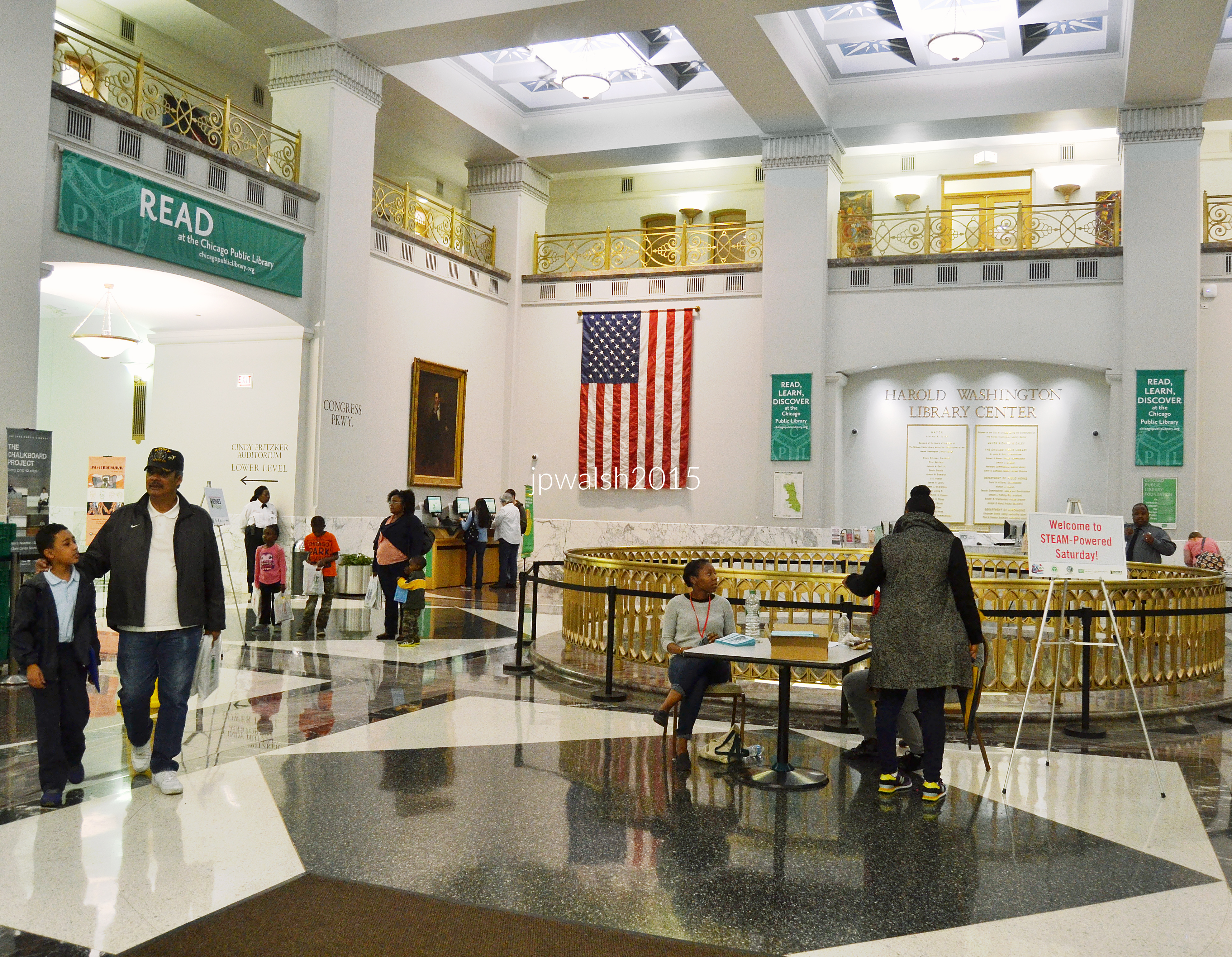
Interior views highlight the building’s function as a major cultural and educational resource, housing millions of items and specialized collections.
The Harold Washington Library houses millions of items across nine floors. At 750,000 square feet, it is the largest public library building in the world. see – Harold Washington Library | Loop Chicago – retrieved February 16, 2026. May 2015. Author’s photograph. 4.0 mb DSC_0476 (1)
Study Room. May 2015. Author’s photograph.4.88mb DSC_0488 (1)
On the 8th floor the Visual and Performing Arts Department maintains a comprehensive music archive. One major collection, for example, is the Martin and Morris Collection which contains roughly 1,500 scores from the renowned gospel music publisher. May 2015. Author’s photograph. 3.61mb DSC_0486.
The photographs document the library from multiple perspectives, emphasizing its urban presence, monumental scale, and role within the Chicago streetscape.
Harold Washington Library after dark. December 2015.Author’s photograph. 3.7mb DSC_0980 (3)
This explanatory article may be periodically updated.
FEATURE image: 822 Bryant, Winnetka, 1901. A grand example of the Shingle style working its way through the Arts and Crafts movement and influenced by the recent Prairie School’s horizontality and openness (see below for more details). Author’s photograph. 8/2014 99% 6.92mb.
Winnetka’s architectural identity was shaped during a formative period from the 1880s to the early twentieth century, and its houses, churches, and streetscapes continue to reveal the evolution of America’s most influential architectural styles within one of Chicago’s most distinctive suburban communities.
Text & photographs by John P. Walsh.
844 Prospect, Winnetka, 1885 (with later additions).
The central section with the steeply pitched roof with a prominent flare is the oldest part of the house. It is the American Queen Anne style in vogue in the 1880s and Classical Revival style that emerged following the World’s Columbian Exposition in Chicago in 1893. The sunporch abuts a two-story porch whose corner columns are the Ionic order. August 2014. Author’s photograph. 7.79mb 95%
The south-facing façade has a tall chimney that rises from the ground to above the roof peak. The main entrance is under a shouldered segmental arch held up by columns of the relatively uncommon Roman Doric order. The beige-colored metal siding is a modern addition. August 2014. Author’s photograph. 6.04mb
824 Prospect Avenue, Winnetka, c. 1900.
There is a prominent cornice with a garland frieze below a tiled hipped roof that has a central dormer with a Palladian window. The porch, supported by Ionic order expanded columns, wraps around the front to embrace a two-story bay facing south. Originally this offered a second -floor open sunporch. August 2014. Author’s photograph. 6.76mb
800 Lloyd Place, Winnetka, 1901.
A traditional cube structure which is half stucco and half shingled is covered by a hipped roof that is slightly flared at the eaves. The main roof’s central dormer as well as the main entrance have their own hipped roofs. There is a slight polygonal bay seen on the east side. August 2014. Author’s photograph. 6.15mb
Winnetka showcases a variety of styles, including Queen Anne, Shingle Style, Arts & Crafts, Classical Revival, and Gothic Revival. Residential architecture demonstrates the transition from Victorian complexity to the broader, more horizontal forms associated with the Prairie School era.
Sheridan Road, Winnetka, Illinois. August 2014. Author’s photograph. 3.01mb
Sacred Heart Church, exterior. August 2014. Author’s photograph. 4.58 mb
The grand Neo-Gothic building that stands as Sacred Heart Church in Winnetka was built in 1928. While the parish itself was originally founded in 1897, the first wood-frame church structure was razed in 1908 to accommodate a larger building. Following a three-year fundraising campaign, construction on the current stone structure began and was finalized in 1928. The church later underwent major interior renovations in 1957 and 1994, updating its sanctuary layout and lighting while retaining its historic architecture.
In July 2018, Sacred Heart Church in Winnetka and St. Philip the Apostle in Northfield officially consolidated to form Divine Mercy Parish. This merger was born of modern necessity. A steep decline in active participation, paired with an ever-increasing reliance on private donor largesse and supplementary funding, had made it mathematically impossible for either church to independently sustain its physical footprint within the local community. When a photograph of the interior was captured in 2014, Sacred Heart still stood as its own distinct parish. At that time, its vestibule wall was proudly lined with the portraits of past pastors—a quiet testament to a long, deeply rooted history.
Yet, the structural reality facing Sacred Heart reflects a broader macro-trend. Across the United States, modern Catholic parish life and its foundational institutions have been locked in a severe downward trajectory since the 1960s. The Archdiocese of Chicago’s own data frames this cultural erosion through stark statistical realities.
Less than 17% of Catholic Millennials attend Mass on a weekly basis, while more than one-third of that same millennial demographic—those born after 1986—now claim no religious affiliation whatsoever. This detachment deepens as young people grow, resulting in an overwhelming 85% of eighth graders, across both public and private schooling, completely walking away from the practice of the Catholic faith by the time they reach early adulthood at age 23.
Over the course of just the last two decades, overall Mass attendance has plummeted by more than 25%, leaving more and more pews empty. This institutional attrition begins early in life, fracturing the traditional pipeline of the faith before adulthood even arrives. Today, a significant portion of “cradle Catholics” never complete their foundational sacraments; approximately 20% of baptized children never receive their First Holy Communion, and 40% never move on to receive the Sacrament of Confirmation. What remains on the North Shore is a consolidated, leaner presence—a community adapting to preserve its legacy in an era of rapid secularization. See – https://www.renewmychurch.org/mission – retrieved November 21, 2023.
Sacred Heart Church, interior, looking to the main entrance from altar. Under the overarching “Renew My Church” initiative launched by Cardinal Blase Cupich, the Archdiocese of Chicago targeted approximately 15 to 20 parishes for formal closure or consolidation structures across its multi-phase regional planning waves in 2018.Then-121-year-old Sacred Heart Churchparish could no longer survive on its own and was consolidated with another parish in Northfield that year. August 2014. Author’s photograph. 5.06mb DSC_0227 (1)
822 Bryant, Winnetka, 1901.
A grand example of the Shingle style working its way through the Arts and Crafts movement and influenced by the recent Prairie School’s horizontality and openness. The domicile was built by progressive American architect Augustus Barker Higginson (1866-1915) then associated with architects Myron Hunt & Elmer Grey in Los Angeles. Higginson later located his own firm to Santa Barbara, California. The Winnetka house is an L-shaped plan with broad sloping pitches roofs. The window groupings have plain surrounds that fit elegantly into shingle walls which flare slightly when they reach the ground. See – https://pcad.lib.washington.edu/person/7142/ – retrieved November 21, 2023.
Thirty-five-year old Augustus Barker Higginson, an architect located in Los Angeles, California, built the impressive Shingle style house at 822 Bryant Avenue Winnetka in 1901. Public Domain.
Christ Church, 784 Sheridan Road, Winnetka, 1905.
Christ Church, exterior and main entrance. August 2014. Author’s photograph. 6.60mb
The church was established in 1869 with its adjacent Garland Cemetery (Christ Church Churchyard) grounds begun in 1876. The stone church was dedicated in 1905.
Religious buildings such as Christ Church contribute significantly to Winnetka’s historic character and cultural memory.
Christ Church (also known as Church on the Hill) was the gift of the William Hoyt family. It was built as a memorial to the Hoyts’ daughter and three grandchildren who were tragically killed in the 1903 Iroquois Theater fire in Chicago and buried in church’s adjacent cemetery. August 2014. Author’s photograph. 7.77mb
Gothic revival: Charles J. Connick Studio (1912-1945). Harriet Leonard, born Albany, NY, Nov. 17, 1875 – died Winnetka, Feb. 28, 1923. Connick’s work in stained glass is noted for its brilliant colors, rich symbolism and abundant use of scripture passages. August 2014. Author’s photograph. 7.66mb
About the deadly December 1903 Iroquois Theatre fire:
newspaper headline, 1903. Public Domain.
The Iroquois Theatre fire remains the deadliest single-building fire in United States history. It occurred on Wednesday, December 30, 1903, at the theater located at 69-73 Randolph Street (known today as 24-28 W. Randolph Street) in downtown Chicago, Illinois. That afternoon, the venue was packed to the brim with teachers, mothers, and young children enjoying their holiday school break.
During a performance of the musical Mr. Bluebeard, an electric arc light short-circuited and sparked a fire in the stage scenery. As the blaze grew, the theater’s “asbestos” safety curtain snagged and failed to lower. When performers fled out the large rear stage doors, the sudden influx of air created a massive cold draft, generating a ferocious fireball that shot out into the auditorium catching the ceiling on fire and trapping many hundreds of people in fiery darkness and thick, toxic smoke.
Out of an estimated crowd of roughly 2,100 to 2,200 attendees, approximately 1,500 to 1,600 people successfully escaped to survive, while more than 600 lost their lives in a span of just fifteen minutes. The vast majority of the victims were young women and children who died from asphyxiation and suffocation or were trampled by panicked crowds and crushed to death against exit doors that were locked or opened inward.
This profound tragedy fundamentally revolutionized public building safety codes globally. It led directly to the invention of the panic crash bar, which allows doors to open instantly under body pressure. It also established mandatory ordinances requiring functional outward-opening exit doors, automatic fire sprinklers, non-flammable stage curtains, and clearly illuminated, standardized exit signs. Through these permanent changes, their deaths were not in vain.
Following the fire, the heavily damaged interior of the original building was thoroughly rebuilt with strict new fire safety features and reopened in late 1904 as the Colonial Theatre. The Colonial operated for 20 years before it was demolished in 1925 to make way for a grander, completely new structure: the Oriental Theatre opened in 1926 and served as a cinema, a vaudeville house, and a live theater venue. In February 2019, the Oriental was officially renamed the James M. Nederlander Theatre.
Christ Church, Winnetka. August 2014. Author’s photograph. 2.75mb DSC_0388 (1)
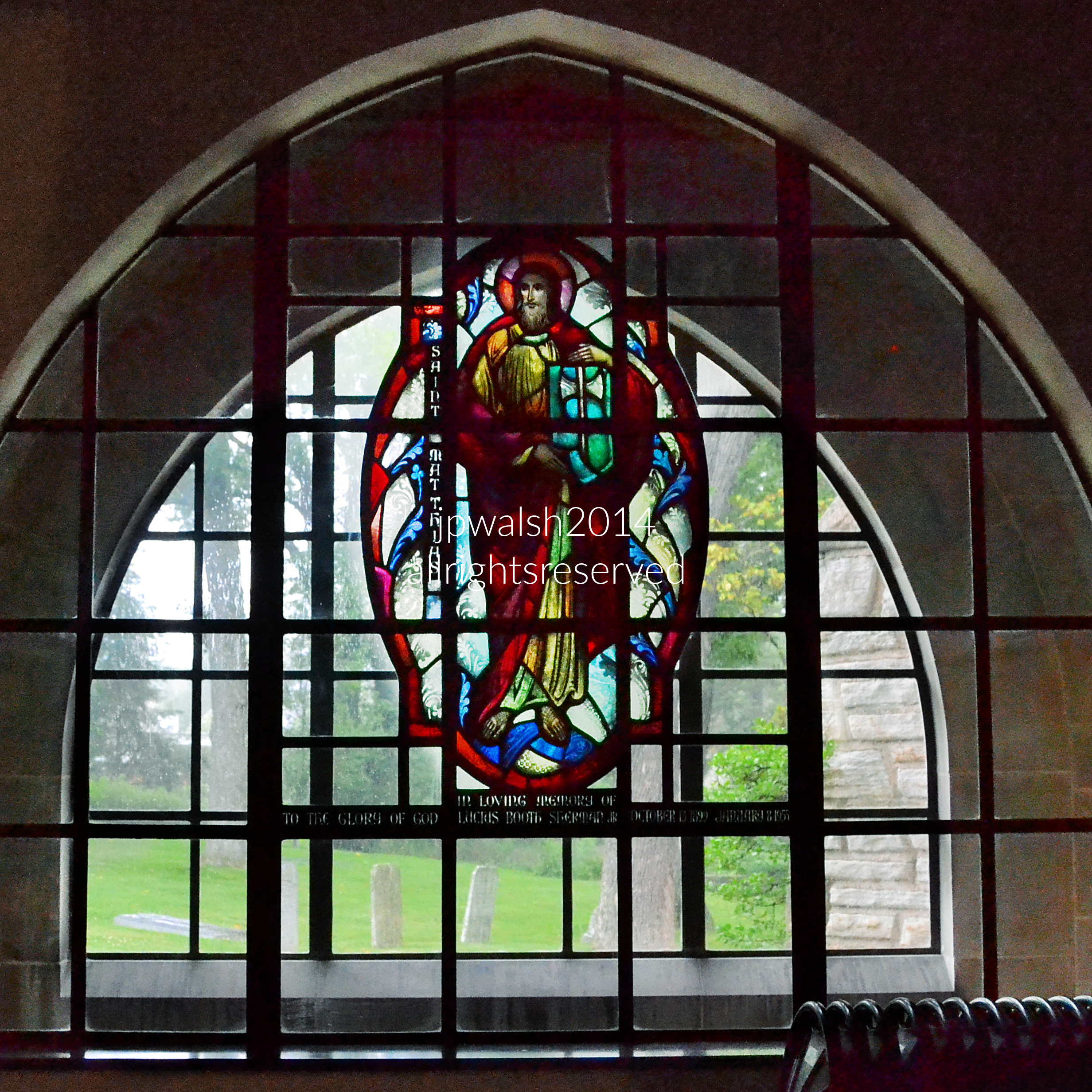
The saint in the central medallion is Saint Matthias, the apostle chosen by the remaining eleven disciples to replace Judas Iscariot after the crucifixion of Jesus. He is traditionally depicted holding a book or a halberd (axe). This Gothic Revival stained-glass window was also created by the Charles J. Connick Studio of Boston. Looking past the glass, the gravestones visible outside the window belong to the historic Christ Church Churchyard. Often referred to locally as the Garland Plot, it stands as the oldest cemetery on the North Shore, established in 1836. In 1876, John Garland donated the land to the Episcopal Diocese of Chicago to build Christ Church, with the strict legal condition that the churchyard remain a permanent family and pioneer burial lot. Visible just through the window are some of the historic graveyard’s headstones.
Sources:
A Guide to Chicago’s Historic Suburbs on Wheels and on Foot, Ira J. Bach, Swallow Press/Ohio University Press, 1981, pp. 565-74.
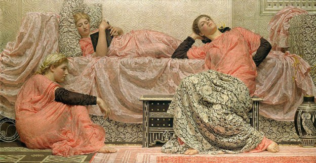
FEATURE image: Albert Joseph Moore (1841-1893), READING ALOUD, 1884, oil on canvas, 42.24 x 81 in., Glasgow Art Gallery & Museum.
The artist: Albert Joseph Moore (1841-1893).
Albert Joseph Moore was one of the leading figures of the British Aesthetic Movement, creating meticulously crafted paintings that placed beauty, harmony, color, form, and decoration above narrative or moral instruction. His idealized female figures inhabit timeless settings that blend classical inspiration with Victorian artistic experimentation, making him a unique voice in nineteenth-century British art.
Albert Moore: Life and Artistic Legacy
Albert Joseph Moore was born in 1841 into a family of artists in North Yorkshire in England. Moore through his own advanced aesthetic experiments in the milieu of theoretical and practical advancements of mid-to-late 19th century modern art in England and France – such as a systematic analysis of nature, mathematical plotting, and principles for quintessential combinations of color, line and form – created art that was, in formal terms, in its conception and execution, on the cutting edge of abstraction that would continue to develop and blossom into early 20th century Cubism. Moore’s art gained the respect of other progressive artists (Moore was called “a painter’s painter”), patrons and collectors, if not always the critics and contemporaries who viewed Moore’s work as merely decorative. Moore was actively collected in his lifetime and exhibited regularly in major venues such as the Royal Academy. Unmarried and of a lifelong independent disposition, Moore died in 1893 at 52 years old, having just completed his last monumentally ambitious artwork (“The Loves of the Winds and the Seasons,” Blackburn Museum and Art Gallery, posted below) a handful of days before. Several of Moore’s pictures are now in public collection throughout the UK, including the Tate and the British Museum in London.
Moore became a major representative of the Aesthetic Movement, often summarized by the ideal of “art for art’s sake.”
Azaleas (1867-1868)
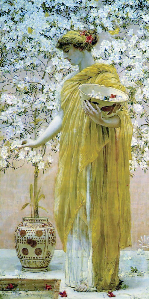
Albert Joseph Moore (1841-1893), AZALEAS, 1867, Hugh Lane Municipal Gallery of Modern Art, Dublin, Ireland.
Azaleas was a popular artwork by Albert Moore for its harmonies of color and the “Greek refinement” that the artist infused into his work. This bigger-than-life-size canvas called Azaleas was painted in 1867, exhibited in 1868 and demonstrates the artist’s ability to represent the human figure on a grand scale.
The featured works depict idealized women in dreamlike environments that feel both classical and modern. His paintings emphasize decorative harmony, color relationships, pattern, and graceful composition rather than storytelling.
Geometry and Preparation
The 26-year-old artist had some architectural design experience in theory and practice and used this in his preparatory process. This artwork incorporated ideal geometry along with typical academic methods.
Moore’s process followed, first, making studies of the nude figure and draped figure. Moore next made a larger-than-life-sized full-scale nude figure cartoon which, at this stage, was informed by geometric abstraction of the figure in a setting guided by, or through, the milieu of the object in the artist’s hands.
The geometric quality guided the composition rather than was externally imposed by the artist. Moore’s “system of line arrangement” sought the directions of the prominent lines of the composition so to plot parallels of them throughout the drawing resulting in a statuesque yet corporeally vivacious figure.
Nature, specifically the landscape, ultimately served as the inspiration for the manifestation of line parallels and optical balance rather than the mathematically ideal. Moore’s geometric construct and its interplay determined every element of the composition – from the position and placement of the figure to the location of accessories, such as wall hangings, distribution of drapery folds, and architectural elements. The canvas’s shape and size also were ultimately determined by this idiosyncratic geometric arrangement.
Traces of Moore’s preparatory practice are in evidence in Azaleas’ full size nude cartoon with its vestiges of diagonal and horizontal lines through the midsection of the figure and near to her feet. Using these lines in the nude drawing it is apparent that Moore experimented with the placement of the figure’s head, the extended hand, and a raised heel which was ultimately hidden under opaque drapery. Moore used a live model for his figure.
Technique and Execution
The final nude cartoon was transferred to the canvas and this outline was built up with oil colors. A drapery cartoon was then transferred on top of the transferred, built-up nude figure cartoon. Using this method Moore rendered greater transparency of the fabric since the underlying nude cartoon showed through faintly. This painstaking preparation was masked by Moore’s fresh and free style of painting. For instance, the drape folds of the left shoulder are painted in long, fluent, and elegant strokes while the azaleas are rendered in energetic strokes. Moore’s objective was for the final painting to look like an impromptu and expressive sketch when, in fact, it was carefully planned and executed.
About painting Moore taught his students to think long about it but execute with quickness and determination. This technique aided in transforming oil painting into the manner of Graeco-Roman fresco in that Moore’s working method allowed for painting only what could be finished in a day.
Japonisme and Color Harmony
Moore’s careful planning, rapid execution, and brush technique also suggested the influence of Japonisme. Asian influences in Azaleas included the carp bowl held in the women’s arm (an actual studio prop) and the geometric pattern in the azalea pot whose symmetry Moore saw as part of both Greek and Japanese art. To integrate and transition the predominantly yellow figure in the predominantly white background Moore used a device taken from Japanese art of painting flitting butterflies around the azalea bush. Moore also painted russet blossoms in the woman’s hair and bowl and on the floor that further unites the monumental composition.
Moore’s observation of Japanese prints also likely influenced the English artist’s color scheme in Azaleas. This is identifiable in its limited schematic of hues. The color placement, however, was also subject to the geometric practices in the whole composition.
Critical Reception
When Azaleas was exhibited at the Royal Academy in 1868 it was consigned to an out of the way place on the wall of its North Room. It was observed that Moore’s canvas looked more like a tapestry than an oil painting. In this way, Moore anticipated James McNeill Whistler’s comment about color in that it should appear “embroidered” on the canvas, in the same way a thread is embroidered on fabric. Whistler attributed this color quality to Japanese art in that those artists looked for repetition in color application and not contrast.
Architecture critics in 1868 noticed and especially admired Moore’s Azaleas. Its systematic repetitions and geometric construction were labeled the only “decorative” painting in the 1868 English exhibition. Art critics were less generous. Straining with opera glasses just to see the work they recognized its beauty and Moore’s talent but called its design and execution eccentric. Others turned up their critical nose to the new decorative work as “curious” and little more than a luxurious indulgence of art for art’s sake. Art critics were unhappy with the paintings’ colors as they found they lacked the requisite black that marked contemporary French art and, instead, opted for a quiet and delicate dreamscape.
English writer William Michael Rossetti (1829-1919) declared Azaleas one of the most important English pictures of 1868 and decried those looking to judge it by way of actual historical pictures from Greek antiquity. With Algernon Swinburne (1837-1909), Rossetti compared Moore’s artwork to another painting in the 1868 exhibition: “The Wife of Pygmalion, A Translation from the Greek” by the older George Frederic Watts (1817-1904). In that work Watts sought to create a painterly equivalent of classical sculpture. William Gladstone (1809-1898) wanted to purchase Watts’ picture after seeing it at the Academy in 1868. In a letter to Gladstone in May 1868 Watts informed Gladstone that it had been “claimed” but invited Gladstone to visit him in his studio to see the cast of the fragmentary Greek original from which the painting was derived.
Swinburne saw the poetry and musicality of Moore’s artwork .While most art critics snubbed the painting (and by extension the painter) for its art for art’s sake qualities, Swinburne praised them. Of Azaleas, Swinburne wrote: “The melody of color, the symphony of form is complete: one more beautiful thing is achieved, one more delight is born into the world; and its meaning is beauty; and its reason for being is to be.”
Sea-gulls (1871)
Albert Joseph Moore (1841-1893), SEA-GULLS, 1870/71, oil on canvas, 27 x 61 inches (68.5 x 154.8 cm), Williamson Art Gallery & Museum, Birkenhead, UK.
The Whistler Controversy
Sea-gulls was accepted for the 1871 Royal Academy exhibition. It was the third painting for Albert Moore to exhibit at the Royal Academy. Moore was absorbed in painting Sea-gulls, a major work, for British shipping magnate Frederic Leyland (1831-1892) and this work occupied him up to the Royal Academy Exhibition that spring.
Its creation by the 36-year-old Moore was not without headaches owing to controversy. Moore’s friend and admirer, American ex-patriate artist, James Abbott McNeill Whistler (1834-1903), had learned of Moore’s preliminary work on the painting through Leyland, a major art collector and the artists’ mutual friend.
Whistler expressed concern that Moore’s work perhaps overlapped adversely with some of Whistler’s own preliminary sketches for a painting. Whistler saw a pair of sketches Moore had sent to Leyland as potential commissions. Whistler felt that Moore’s sketch may have been influenced by seeing one of Whistler’s sketches. Whistler feared that if Moore’s painting was exhibited first, it would reflect badly on Whistler as an imitator when in fact the artwork Whistler was working on ante-dated Moore’s conceptions. This was a mortifying prospect for Whistler who prided himself on originality.
Whistler’s anxiety may have also stemmed from the fact that with Sea-gulls, Moore would fulfill his second commission for Leyland, while Whistler who introduced them had yet to complete a picture for Leyland that had been commissioned in 1867.
To ease Whistler’s fears, the American artist proposed that Moore accompany another mutual friend, architect William Nesfield (1835-1888), to Whistler’s studio in Chelsea to inspect his older original sketch that Moore had seen.
Nesfield, acting as mediator, concluded in September 1870 that the recent work of the two artists shared themes, but each maintained their own artistic originality. The crisis was averted and led to Moore exhibiting Sea-gulls.
Completion and Artistic Development
During this crisis and shortly thereafter, Moore did not finish to his satisfaction his painting when it was time for its exhibition in April 1871. A major effort required to complete Sea-gulls had deeply undermined Moore’s health. After the exhibition the painting was returned to the artist, but he could not yet immediately set to work on it to completion. Months later it was finished and sold to Leyland.
Nature, Movement, and Surface Effects
In Sea-gulls Moore introduced obvious analogies between the liquid patterns of the sea and the rippling and splashing motion of the figure’s hair and drapery. Moore’s intention was to discern patterns inherent in nature. The drawings also suggest that he exaggerated the effect of air currents by employing the revolving fans that were simultaneously in use for Sea-gulls and another painting titled Shells.
Much of Moore’s work to complete the painting after the exhibition revolved around redressing the picture surface. Moore had been experimenting for some time with the surface quality of his paintings. In the early 1870s, Moore’s technique had developed to combine transparent and opaque fabrics that created unusual layering effects. Following the 1871 exhibition, Moore seemed to apply this technique in Sea-gulls that involved unusually thick paint layers.
Grosvenor Gallery and Lasting Friendship with Whistler
Much later, during the winter of 1880, Sir Coutts Lindsay (1824-1913) – the British artist and watercolorist founded Grosvenor Gallery on Bond Street as an alternative exhibition space to the Royal Academy which became a venue for avant-garde artists, particularly those associated with art for art’s sake – mounted a show on the subject of artists’ working sketches. Moore contributed the preparatory studies for Sea-gulls to the show that included his sketches of hands, heads, drapery, plants and flowers, as well as the painting’s cartoon.
Although biographers of Whistler and Moore have attached no importance to their friendship, particularly after the September 1870 controversy over Sea-gulls which they claim ended it, the artists in fact remained on intimate terms unbroken until Moore’s death in 1893. In the later 1870s they again were thrust together in a contentious situation but this time on the same side of sorts. When Whistler became involved in libel proceedings against Ruskin in later 1878 Albert Moore was the only artist who the American ex-patriate artist could rely on to both publicly attend the proceedings and actually give evidence on Whistler’s behalf.
Albert Joseph Moore was highly admired by James McNeill Whistler, who regarded him as his favorite contemporary British artist.
Reading Aloud (1884)
Albert Joseph Moore (1841-1893), READING ALOUD, 1884, oil on canvas, 42.24 x 81 in., Glasgow Art Gallery & Museum.
Conception and Working Method
Reading Aloud was one of three large-format paintings Albert Moore completed in the 1880s. Completed in 1884, Moore had been working on Reading Aloud for years – at least since 1881. Moore had drawn a chalk sketch of the geometrically designed composition over which the artist would lay a piece of translucent glass. By painting directly on the glass, he could experiment with colors without redrawing the picture. He then could transfer the trial color experiment on glass (as well as a final drawing) onto tracing paper by which the final artwork was then made by pinning the tracing paper to the canvas. The artist then painted the composition directly to the canvas, section by section, working as he painted to unify color scheme and, as figural poses and other details are different in the final artwork than surviving preparatory materials, drawing. It was meticulous organizing and harmonizing creative work that helps to explain why Moore labored for years on the almost 7×4 foot oil on canvas.
Works such as Reading Aloud demonstrate his pursuit of beauty through carefully controlled arrangements of figures, fabrics, colors, and space.
Composition and Symbolism
While these three reclining figures are static their contrasting drapery folds whether they are swirls, zigzags or sweeping diagonals – with the sofa’s swags to unite them – enliven the picture. As classicism revivalists are noted for their mere realism and moralistic anecdote, Moore’s evocation of classicism, though containing allegorical qualities, belies a modernity by way of its abstract combination of line and form in the depiction of languid female figures in a neutral setting. The black-and-white owl vase that Moore included in the lower right corner of the painting had been absent from previous studies (originally it was a seated cat) and provides a narrative sign. It connotes the quality of wisdom as well as perhaps the goddess Athena with which the owl is associated so to apply it to the various states of the readers though the overall picture with its fascination with repose is more subtly mysterious than anecdotal. Yet the classicism/modernity enigma continues as the honey bee which Moore paints on the face of the owl vase was the symbol used by the picture’s purchaser, pig iron industrialist William Connal (1819-1898), for himself.
After his wife of 25 years Emelia Jessie (Campbell) Connal died in 1877, 56-year-old industrialist William Connal faced life alone at Solsgirth, his Scottish country manor. Connal turned his attention to the arts and, in addition to Moore, became an avid collector of contemporary art by such painters as Edward Burne Jones (1833-1898), Edward Poynter (1836-1919), Frederick Sandys (1829-1904), Roddam Spencer Stanhope (1829-1908), Fernand Knopff (1858-1921) and Adolphe Monticelli (1824-1886) along with the Old Masters. Connal owned Symphony in Silver and Grey by American artist James McNeill Whistler (1834-1903) who greatly admired Moore. In 1883, Connal invited Moore to stay at Solsgirth House in Perthshire for a month allowing the artist to recuperate after a serious illness. It was during this stay that Connal commissioned Moore to paint his portrait that shows him wearing a honeybee brooch, the emblem that Connal used on his personal items (Connal’s portrait today is in York Art Gallery).
Geometry, Abstraction, and Critical Response
Moore’s pictorial methodology which he continued to develop over his artistic career is in evidence in Reading Aloud. Moore works out and unifies various and moving parts depicting a scene’s animating personality based in psychology with its physical forms that are mathematically contrived by way of lines and curves and, ultimately, color and texture, and whose impact on the viewer of the completed artwork is allowed to be emotional rather than cerebral. In Reading Aloud Moore constructed the image based on two pairs of diagonals that intersect into a pattern. Though the geometric system is visually subdued, it is evident in the figure on the right whose arms coincide with a set of diagonals. It is obvious also in the picture’s overall use of contrasting bold colors – the fabrics’ pinks and creams are integrated to, though angularly distinct from, the charcoal greys of the covered limbs and book cover. The edges of the book cover also coincide with some of the complex design of diagonal lines whose subliminal quality is an intrinsic expression of the psychic nature of the artwork. This angularity based on diagonals was a deliberate strategy for Moore when he painted the final artwork. There is also the horizontal lines component in the painting manifested in the outstretched arms of the crouching figure at left and the table and vase. Moore’s design strategies were innovative in 1884 startling contemporary viewers approaching to what Cubism would accomplish 25 years later. Critics when viewing Reading Aloud, being neither particularly understanding nor sympathetic to Moore’s methods or intentions, praised the picture’s overall gracefulness but impugned his drawing skills and identified the painting as mostly static decoration. Yet the static figures form part of a complex array of abstract and naturalistic patterns that fill every inch of canvas. Reading Aloud is a testament to the artist’s ability to translate such natural phenomena into a stylized form. Most prominent among them is a fabric effect found in other of Moore’s paintings of the period, in which white lace is layered over cloth of a darker color. Reading aloud was exhibited at the Royal Academy where, starting in 1883, Moore chose to exhibit annually.
The Loves of the Winds and the Summer (1893)
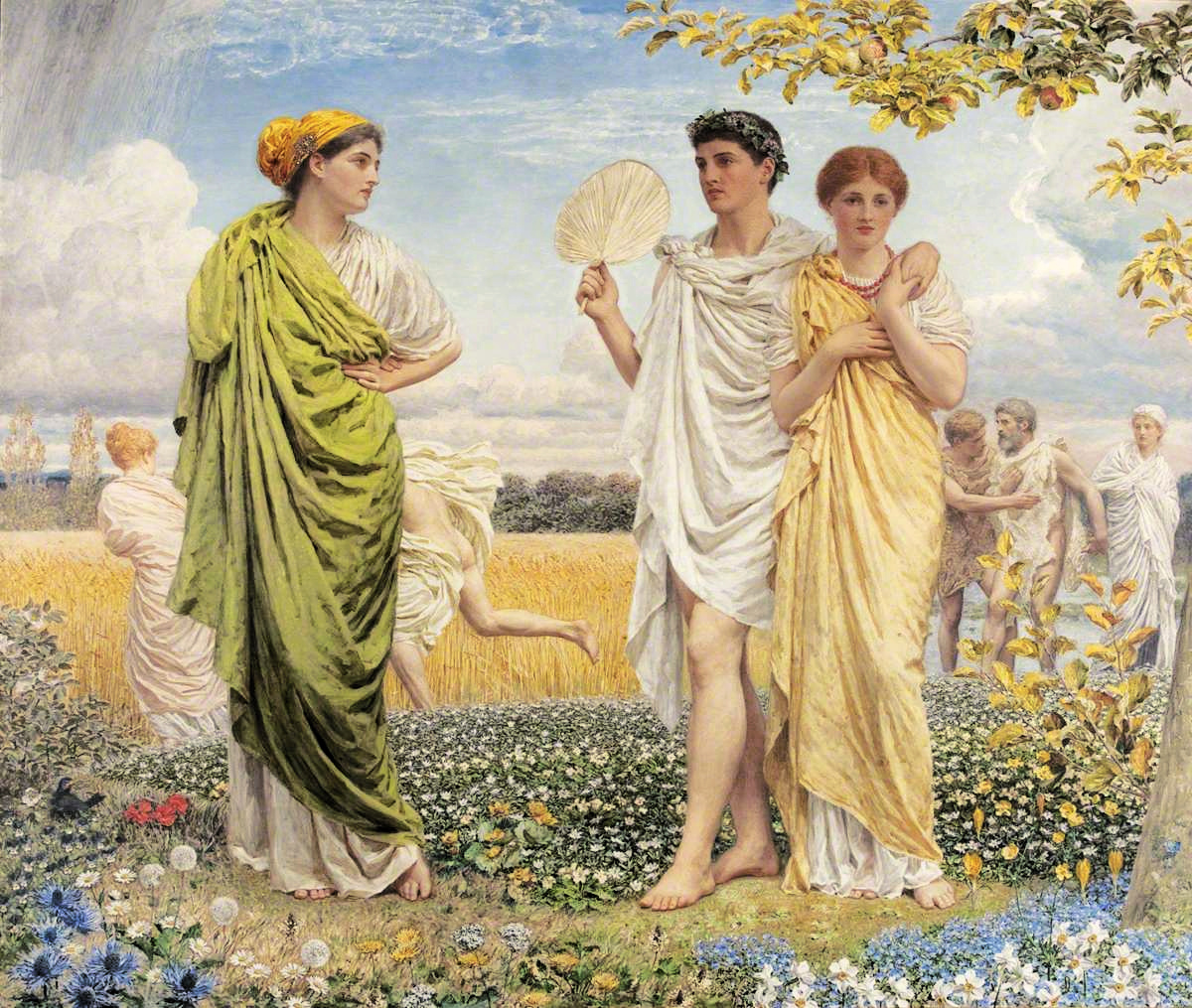
Albert Joseph Moore (1841-1893), The Loves of the Winds and the Seasons, 1893, oil on canvas, Blackburn Museum and Art Gallery, Blackburn, UK.
Moore’s Final Masterpiece
The Loves of the Winds and the Summer was English artist Albert Moore’s final and largest artwork of his career. It is 6 feet tall and 7 feet wide and is the jewel in the crown of the Blackburn Museum and Art Gallery near Manchester, England. It is the result of Moore’s study of the psychology of his subject matter, that of love. Love begins to manifest formally for Moore by the expression of soft bodily postures, changing and harmonious curves, and piercing gazes expressed in deep coral colors. The male figure of the Wind is flanked by the spurned female figure of Summer to the left and the embraced female figure of Autumn to the right. Moore was so enveloped in his amorous themes that while working on this picture he was writing poetry about what the human face was like when in love – and it is found in his picture. The Love of the Winds and the Seasons is Moore’s fullest expression of animating personality united to depicted physical forms that are first lines, curves and color, with the result being an emotional impact on the viewer who encounters the artwork.
Moore drew inspiration from ancient Greek sculpture and classical forms but was not attempting archaeological reconstruction.
Art in the Face of Terminal Illness
This exquisite artistic sensitivity by Moore is made more remarkable since the artist was dying in 1893. In the company of his young and attractive live models in his new capacious art studio, Moore worked day after day on this work. Moore had cancer (a tumor on his thigh) and had submitted to three operations to keep ahead of it. When his doctors told him they could operate no more, and that the cancer continued to spread throughout his body, Moore was resigned to his situation. He is reported to have said: “Well, there’s an end of it.” In the limited time left to him Moore intended to finish his painting of love, The Loves of the Winds and the Seasons. The artist did not want to lose any time. His legs had swollen to twice their size and had to be drained. In acute pain he worked around the clock for the next six months. His friends thought the intense work as well as the cancer was killing Moore but as the painting progressed to completion, they observed that the artist’s personal tranquility and happiness became apparent.
Geometry, Design, and Creative Process
The project was monumental – numerous preparatory studies, drapery studies, full scale and life-sized cartoons (i.e., 4’ 9” tall by 1’4” wide for Autumn) , nude studies – all technically meticulous and versatile- and that underwent the artist’s elaborate and idiosyncratic geometric platting system that he began in the late 1870s. Moore was the consummate auteur that slightly older American ex-patriate painter James Abbott McNeill Whistler (1834-1904) most admired in England. Moore conceived his paintings from start to finish – and The Loves of the Winds and the Seasons was at once its pinnacle and completion. Moore, as Whistler aspired to be, was sole master of his work. In 1893 Moore now expanded this mathematical process to amalgamate his diagonals with horizontals so that his creative process could not suffer the critique that Ruskin hurled at Whistler of “ask(ing) 200 guineas for flinging a pot of paint in the public’s face.” The painting was a commission for the Australian mine-owner George McCulloch (1848-1907). Moore’s calculations included various adjustments of the models’ natural poses to submit to the mathematical formulas on the canvas. This formal submission of subjects to linear construction extended to each detail in the entire composition, such as the flowers for which also study drawings were made. Within these design rigidities, the preparatory drawings of the live models and subjects were transferred to the artwork with little idealization though slight but important adjustments were made, such as to Summer’s hairstyle. Knowing his own time was short, Moore made his cartoons in color so that his transfer to the canvas was as efficient as possible as he painted the final artwork. Critics have observed that despite the intense planning and preparation, the final artwork is executed unevenly – parts are meticulous and vigorous, mostly in the foreground, while others in the background are loose and crude. To what degree this is the artist’s intention or the result of his declining health, is a matter for speculation. During the artistic process the terminally ill artist isolated himself mostly. His handful of visitors remarked that the artist was cheerful, cracked jokes, told funny stories, and smoked his pipe. These select parties knew, however, that their social calls were in the context of final good-byes. In those last days and months of Moore’s life, the artist’s mind, by evidence of the art from his past that he referenced in 1893, stretched back to an earlier career which shared long-held important aspects with The Loves of the Winds and the Summer.
Poetry and Meaning
For his last artwork. Albert Moore glossed the picture’s narrative in verses he wrote to accompany it:
Lo! fickle Zephyr chaseth wayward Spring, It is a merry race; Flowers laugh to birds that sing, Yet frequent tears shall cloud her comely face. The South Wind shall with blushing Autumn mate, Contented with her lot; Summer sigheth – such her fate She and her burning kisses are forgot. Two lovers rough for shudd’ring Winter strive, Beneath a shroud of snow; Heaven haply shall contrive Their violence she may not further know.
Legacy and Death
Through its figural and intellectual prism of ancient classical mythology, Moore worked in his career to update the complex equation of the natural world’s varying and transitory seasons to human life’s copious physical, emotional, and spiritual expressions and contradictions. With their immersion in Moore’s modern art, the painter achieved a graciously-contrived visual dramatic interplay of nature and humanity, ancient and present-day, whose quest is eternal in time and space.
Albert Joseph Moore passed away in the middle of the night on September 25, 1893. He died 9 days after finishing his last painting, The Loves of the Winds and the Summer. Moore was 52 years old.
Albert Joseph Moore’s art transformed Victorian classicism into a sophisticated decorative vision that influenced later developments in modern art and design.